What 10 Top Apps Get Right About App2Web (And What to Steal)
5min Read
The biggest consumer apps are using app2web. Duolingo, Strava, LinkedIn, Tinder: instead of sending users through Apple or Google's checkout and giving up 30%, they ...


Zach Witzel
CEO, Helium
Context
The biggest consumer apps are using app2web. Duolingo, Strava, LinkedIn, Tinder: instead of sending users through Apple or Google's checkout and giving up 30%, they redirect to a web paywall they control.
After the April 2025 Epic v. Apple ruling, this went mainstream almost overnight.
We recorded the subscription flows of 10 major apps. Here's what each one does well, and the one thing worth stealing for your product.
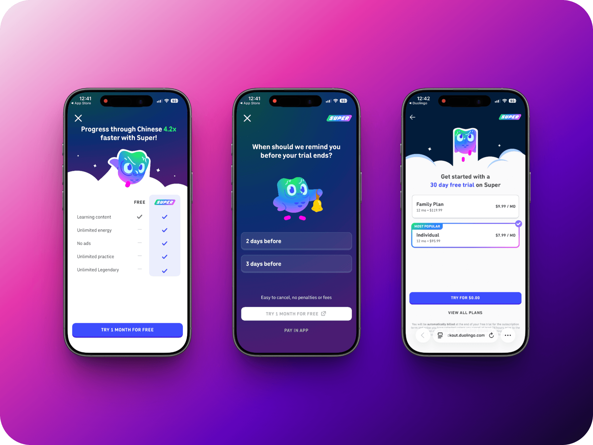
1. Duolingo starts with a pre-commitment
Duolingo kicks off with a question. By the time users hit checkout, they've already made a small decision; it feels like they've started. Web is primary; IAP remains the compliant fallback.
Steal this: Add a micro-commitment step before checkout. A reminder preference, a goal, anything that makes users feel they've already begun.
2. LinkedIn makes it personal
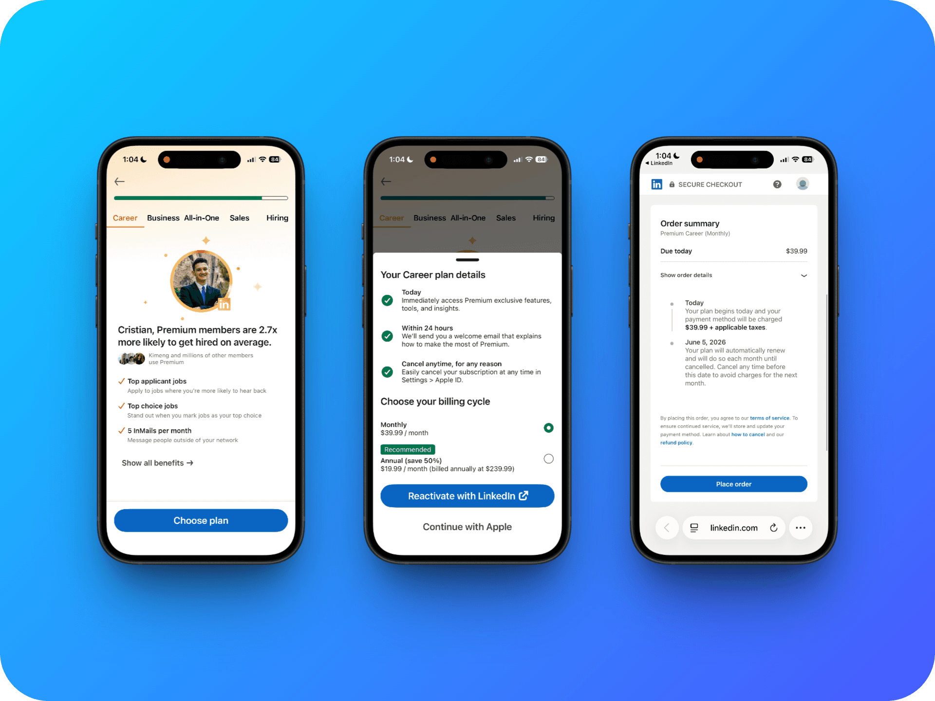
LinkedIn's paywall opens with your name and stats tied to your goal, followed by social proof. A bottom sheet walks through what happens today, tomorrow, and if you cancel, before billing ever comes up.
Steal this: Use data you already have. Onboarding answers, usage patterns, stated goals. A paywall that speaks to a specific user converts better than a generic feature list.
3. Splitwise shows features first, price last
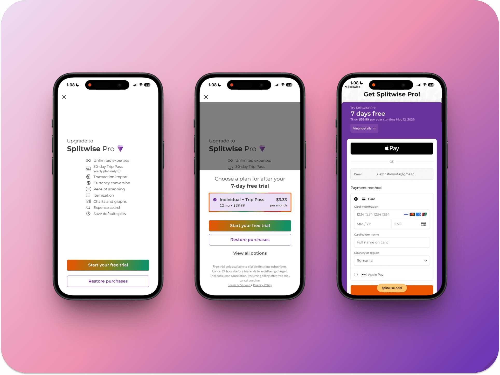
Splitwise breaks the flow into three steps: features, plan selection, then checkout. Most apps collapse all of this into one screen. By the time users see the price, they've already read the features and picked a plan. Web checkout leads with Apple Pay, and the handoff feels seamless.
Steal this: Don't lead with price. Build value across two steps before users see what they're paying.
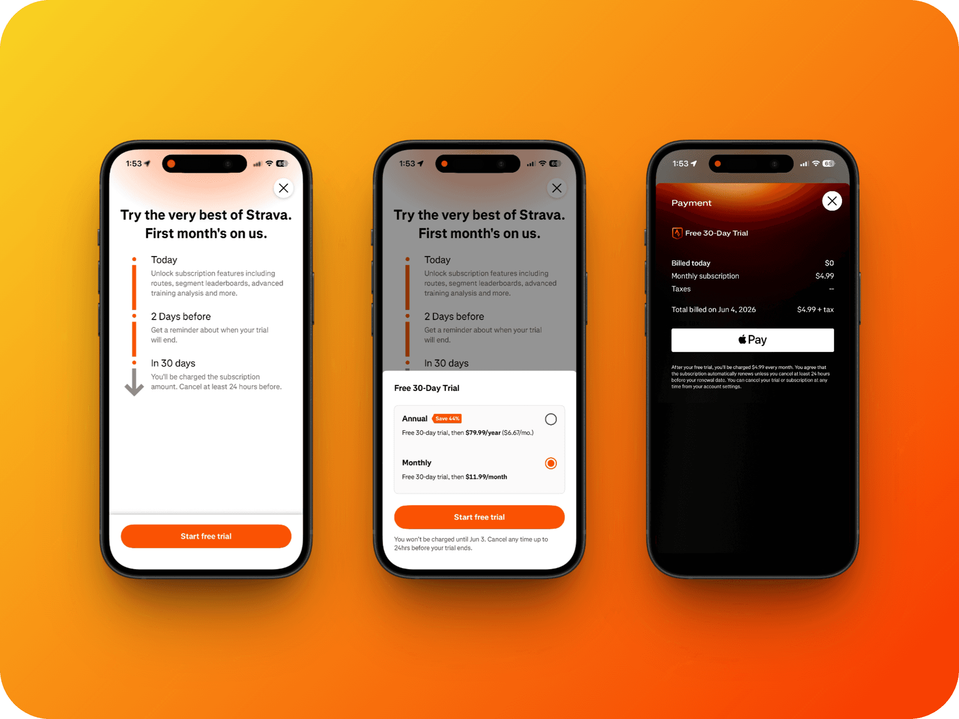
4. Strava's web checkout is Apple Pay only
No payment options to weigh. One tap, done. The dark background makes the bright Apple Pay button impossible to miss.
Steal this: Fewer payment options means fewer distractions. Consider going Apple Pay only.
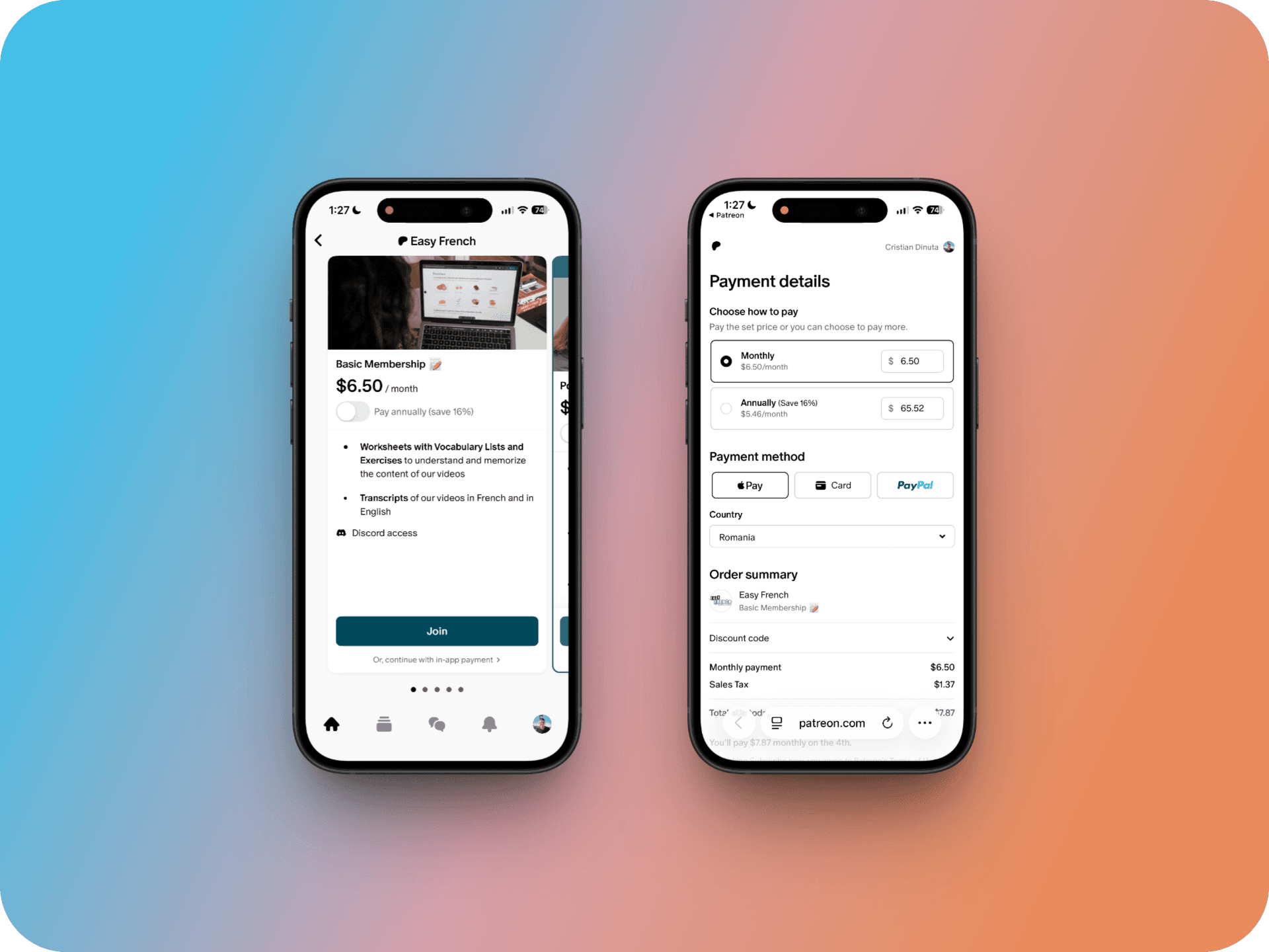
5. Patreon makes the IAP a plain-text link
One button, one link — not two equal options. The in-app payment option sits discreetly under the "Join" button, keeping the flow compliant without competing for attention.
Steal this: If you offer both web and IAP, make the hierarchy obvious.
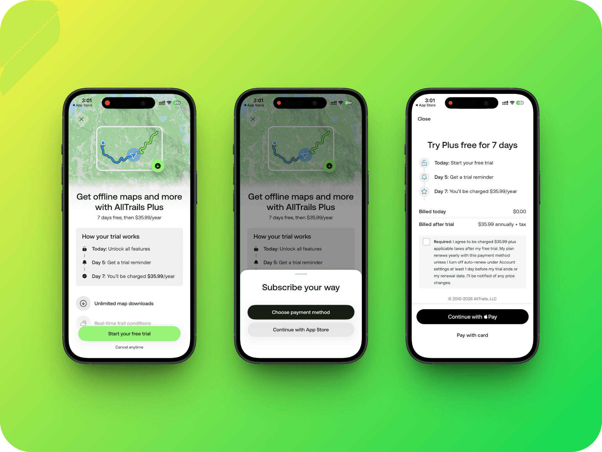
6. AllTrails lets users choose their path
Users can "subscribe their way," but they're visually steered toward the app2web option. The web checkout feels like a continuation of the app — Apple Pay leads, with alternatives available.
Steal this: If you don't want to go Apple Pay-only like Strava, make the most frictionless choice the most salient one.
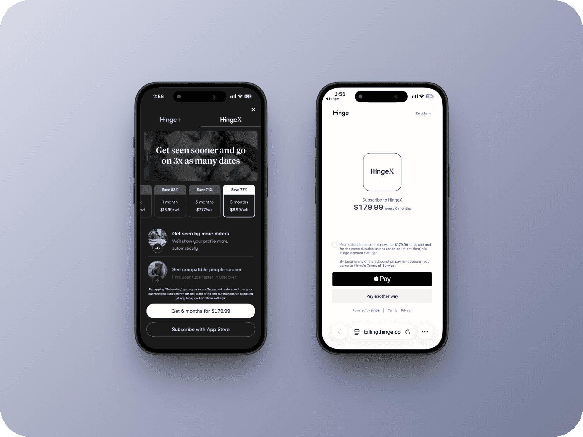
7. Hinge keeps it minimal
Logo. Plan. Pay. Just enough to complete the purchase. Most apps treat the checkout page as a last chance to sell — Hinge treats it as a formality.
Steal this: No need to keep selling on the last screen. If they made it this far, they're convinced.
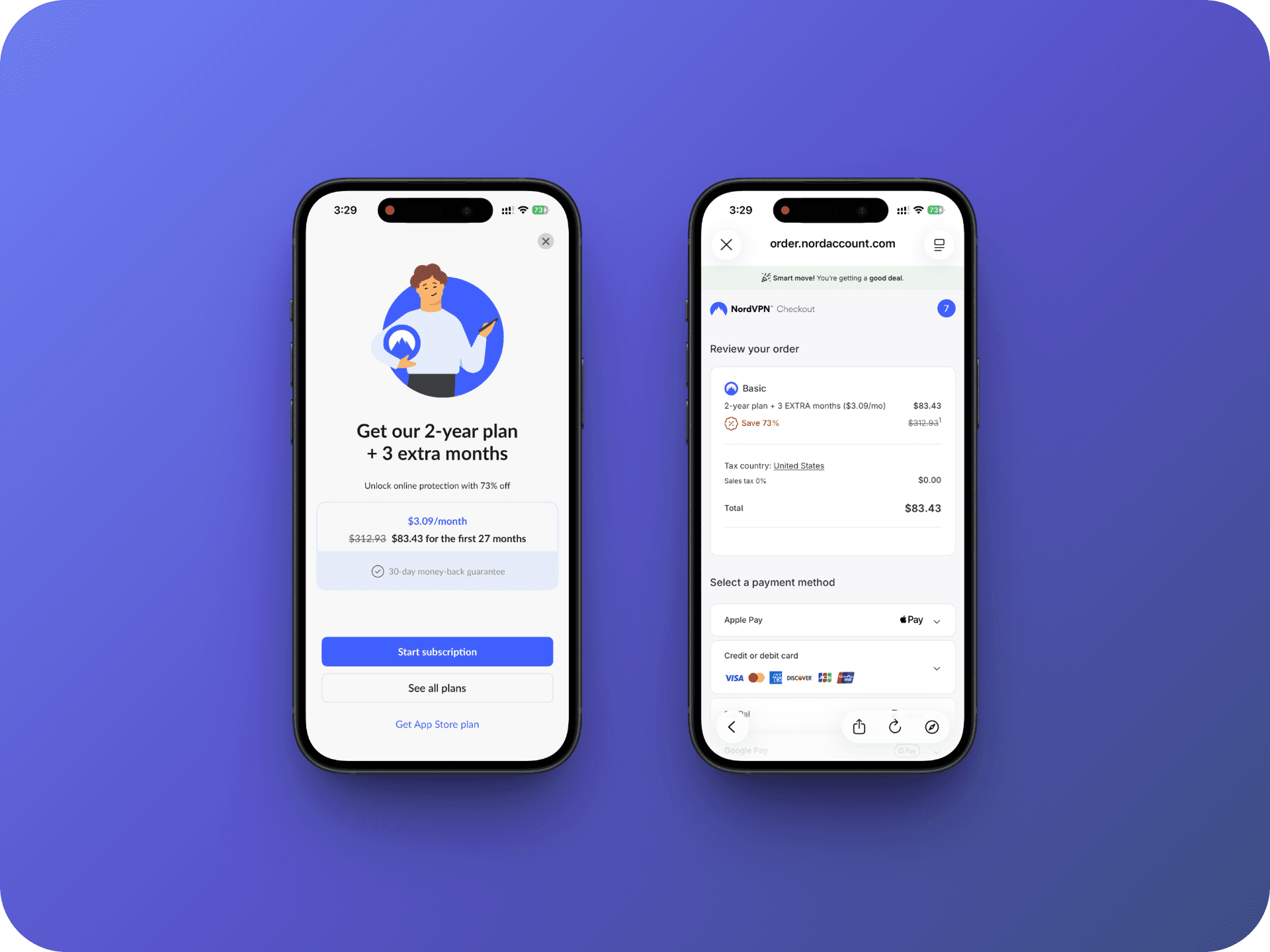
8. NordVPN reinforces the decision at checkout
A small reassurance banner appears right when purchase anxiety peaks — a one-line confidence signal for users who just need a last push. They also offer better deals on web, so the App Store plan becomes the "not-so-smart" choice.
Steal this: Add a reassurance line at the top of your web checkout. "Most popular plan" above the payment button can reduce drop-off at the final step.
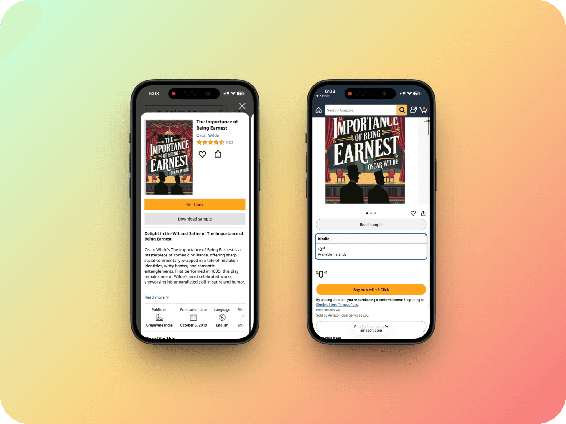
9. Kindle counts on the invisible redirect
Tap "Get book," and you land on the Amazon product page: reviews, format options, one-tap buy. The destination feels native — it doesn't feel like a redirect at all.
Steal this: Your web checkout doesn't have to look like a checkout. If it's a natural extension of the UX, users won't notice the handoff.
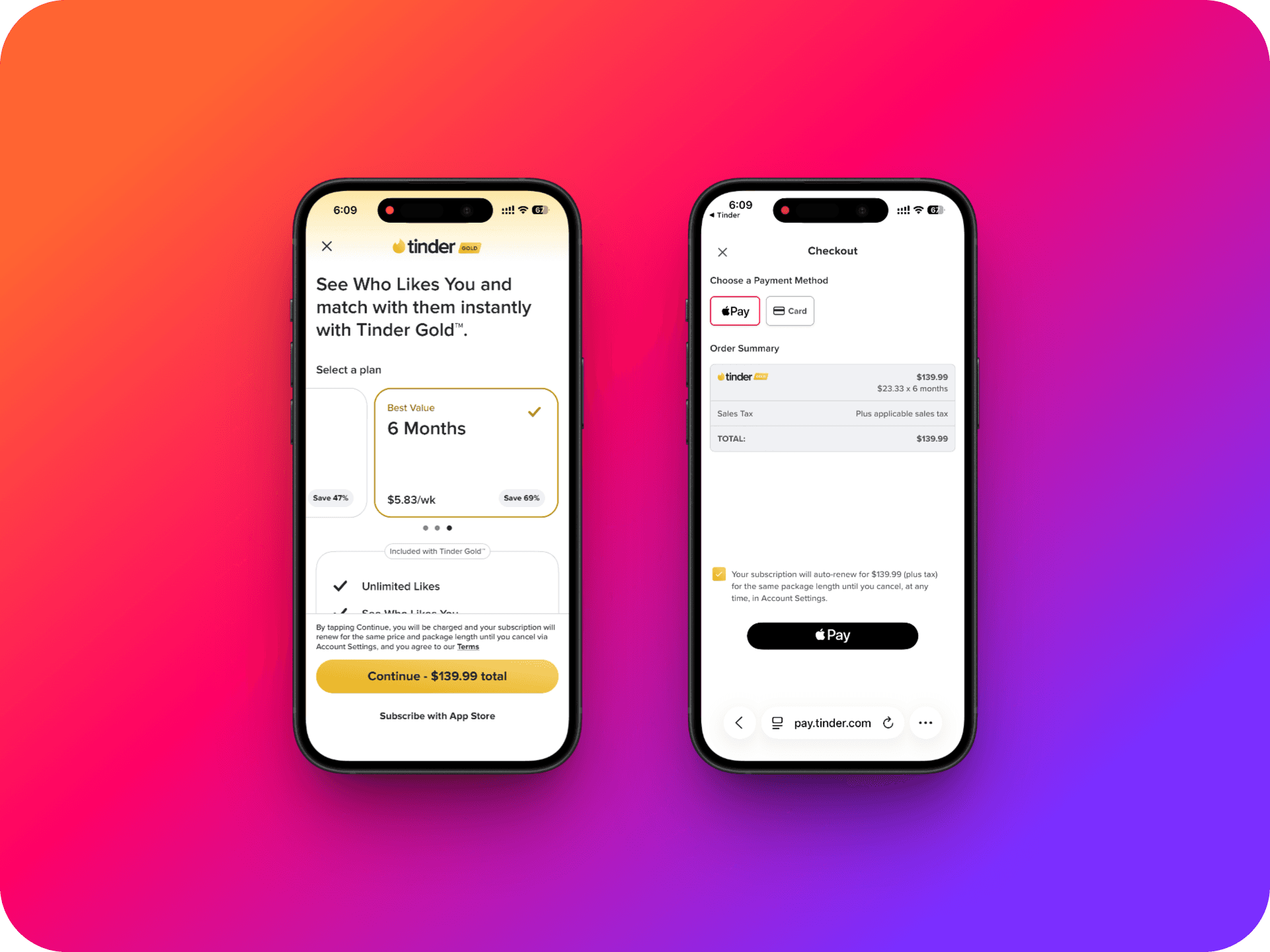
10. Tinder only triggers App-to-Web for high-conviction users
Monthly subscribers go through IAP. Web checkout is reserved for users who've already committed to a multi-month plan — the ones far less likely to churn.
Steal this: Don't show the web checkout to everyone at first. Trigger it for users who've already signaled high intent.