Growth
100 Paywall Tests That Work


Zach Witzel
(
CEO, Helium
)
Jun 4, 2025
Helium builds AI that continuously test your paywall to improve conversion.
Step into the 21st century — Stop pushing buttons around — Start automating testing.
As part of our journey, we’ve collected some of the best-performing paywall tests we’ve seen along with examples. The test ideas are split into a few sections with helpful examples…
The basics
Show a paywall!
Some app founders are intimidated to ask user to pay for their app — Don’t be! Often users are getting much more value than you expect. And if they’re not, showing a paywall will help you realize that and start testing what gets users enough value to pay.
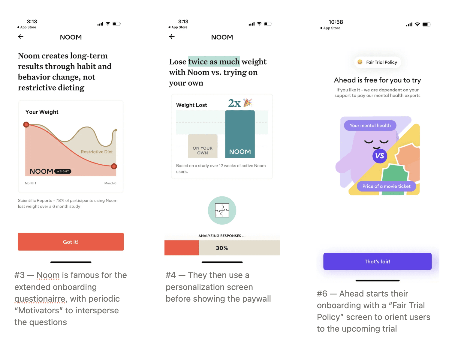
ALWAYS Make sure make sure make sure to put a paywall in onboarding. Around 70-80% of most app’s conversions come through onboarding
Aim to put paywalls at the end of onboarding, and consider making sure that your onboarding is 5-10+ steps before the paywall.
Asking users questions, then showing a ‘Creating your plan’ step can often improve conversion for utility apps
You’ll likely want to ask for a review pre-paywall as some users get turned off from monetization and will leave a poor review
Some apps have increased conversion by starting the onboarding flow with an expectation-setting that this is a paid app
Make sure there’s an obvious spinner state after an attempted transaction, and ensure you’re disabling exit buttons during this pending state
MAKE SURE your paywall is responsive, and looks good on various phone sizes, including iPad, larger phones (iPhone 16 Pro Max) and smallest phones (iPhone 13 mini)
🎈 Helium automatically generates new paywalls for you, so you can launch tests in one click, instead of one week.
Surfacing paywalls
The best way to show in-app paywalls is to make sure you’re showcasing premium functionality front-and-center.
This tends to convert much better than hammering people with less relevant upsell messages
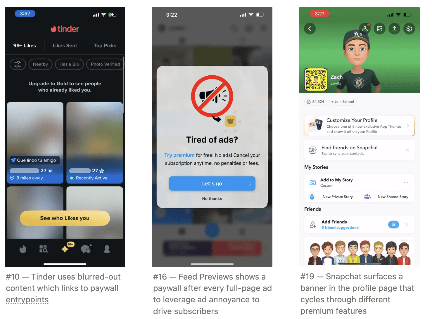
Creating previews with blurred out content (”See your stats”, “Get access to XYZ”) that lead to paywalls tend to convert well
If users click on a feature-specific paywall, centering the paywall on that feature can improve conversion 10-20%
Surface a paywall on app open every 2-3 days.
Consider starting the app-open paywall flow with something engaging, like a form prompt (”What brings you back today”), a video or an update / animation that leads to the paywall.
Make sure to cycle through designs on the app-open paywall, or users quickly develop paywall blindness to it
Make sure that if a user closes an app-open paywall, they see another option to subscribe on the home page, if the app-open paywall includes an offer, make sure to match that offer.
Some people close instinctively then still want to take advantage of the offer.
If you’re ad-based, show a paywall after every full-page ad to take advantage of post-ad annoyance
Consider dynamically increasing ad showings for users that seem likely to convert, a common practice for larger apps. Make sure to track cost/benefit in terms of subscriptions vs churn
Make sure there is a persistent paywall entrypoint almost always in view (bottom-tab, home screen banner)
If you have a upsell banner, consider cycling through value props of the premium offering.
Add a paywall entrypoint in profile. People look here if they want to convert
🎈 Want a free paywall review? Sign up to get free tips from the Helium Growth Team
Paywall Layout
The basic “Hero image + Title + Plan Options + CTA” tends to work best. Overcomplicating can lead to confused users
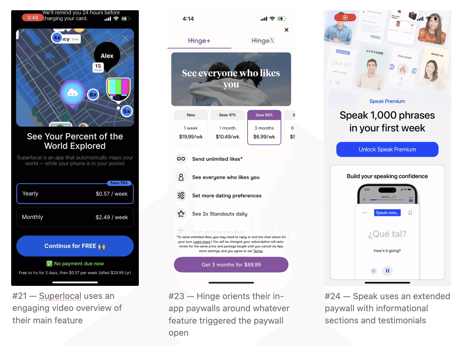
Videos or engaging creatives can often improve conversion
More abstract, value-based, informational paywalls work best at onboarding.
In-app, shorter, more feature-orient paywalls can do better
Longer paywalls (showing content below the viewport cutoff) often works in onboarding and early-lifecycle users.
For long paywalls, always ensure there’s a sticky CTA
For long paywalls, consider showing plan options again at the bottom of the paywall (if there are many), or having them sticky above the CTA (if few)
To make the paywall more engaging, consider adding
Feature grids
Testimonials
Show testimonials from the right region. Even adding a country-specific indicator to each testimonial can improve international conversion
Show testimonial pictures
User callouts
Videos
FAQs
Some Helium customers are getting more value out of the multi-page trial oriented paywall For hero titles…
🎈 Still running manual paywall tests? In 2025?
Get more out of your paywall. Automate paywall testing with Helium.
Hero Sections
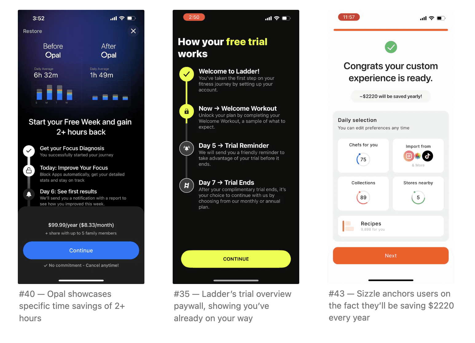
The hero image should be engaging and exciting. Aspirational messaging “Pro users get {xyz value}” with a chart of improvement often works well
Some apps find the blinkist paywall (trial overview), especially if the user base is more price sensitive
Cycling through features in the hero as a carousel can often work well. Just make sure these creatives are extremely compelling.
Some Helium customers are getting more value out of the multi-page trial oriented paywall, where the first page focusses on value and free trial start, then the reminder, then the last page shows payment options.
Always include “Free” if you’re offering a free trial
Especially for in-app paywalls, consider framing it as a ‘Discount’ in reference to the annual discount relative to monthly
Quantifying the benefit can improve conversion
“Pro users are 5.6x more likely to {achieve XYZ goal}”
Simplify header “Start for free” > “Start for 7 days free”
If you’re tied to something in the real world, try to anchor it on that pricing
E.g. slopes, flighty, trips
If you’re savings related, show price compared to savings
🎈 Helium automatically generates you new paywalls to test by analyzing your paywall conversion, and hundreds of tests we’ve seen work.
Paywall Design
Exit buttons
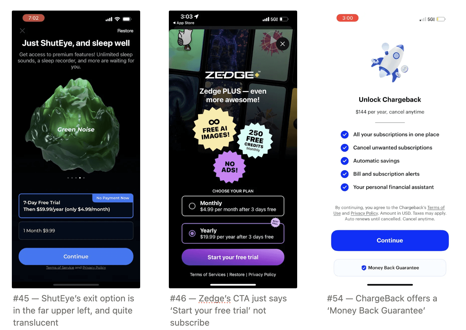
Make sure the exit option is one of the least emphasized components on the page. Ensure it’s not a contrast color (light gray works)
Some apps find success by making sure there’s engaging content right around the ‘X’
If you do this, make sure to track onboarding conversion and churn, as this could hurt onboarding conversion (even if it improves subscription rate)
Primary CTA
The less ‘committal’ the CTA the better
Continue, Start for Free, Start {X} days free tend to work better than “Subscribe”, “Join Pro” etc
Try different CTA text, but choose the best one for each language.
What works best in English can be different than what works best in Spanish, Korean, or Arabic
Delaying the CTA appearance (including dismissal) so users are forced to read the content can work well
The CTA should be the only contrast-colored button on the screen. Avoid having it share colors with other elements
🎈 Wondering what to test next? Join Helium’s waitlist for a free paywall review session.
Messaging
Much of the goal of messaging is to reduce the sense of commitment. Adding these callouts have improved conversion substantially for Helium customers
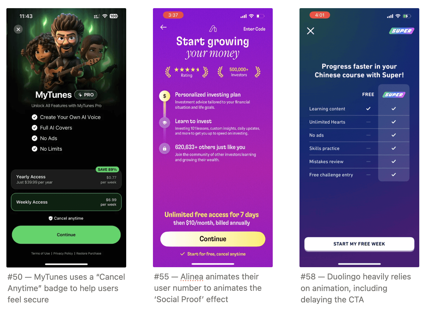
“Cancel anytime”
“No payment due now”
“No commitment”
“Secured by the App Store”
Consider a “30 day money back guarantee” to reduce sense
Use social proof to show how many people have already subscribed.
For feature overviews…
Add “Start for free” at the top / bottom of feature lists. Consider contrast-coloring this
Sell outcomes not features
“Get fit in weeks” > “AI fitness coach is better and cheaper than IRL”
Consider animating this content to improve engagement and conversion
E.g. animate in each bullet in a list
Adding a ‘Double click’ for each feature can improve feature comprehension and conversion
🎈 Helium can automatically generate new messaging tests, and even help you automatically test the best messaging for each language.
Plans
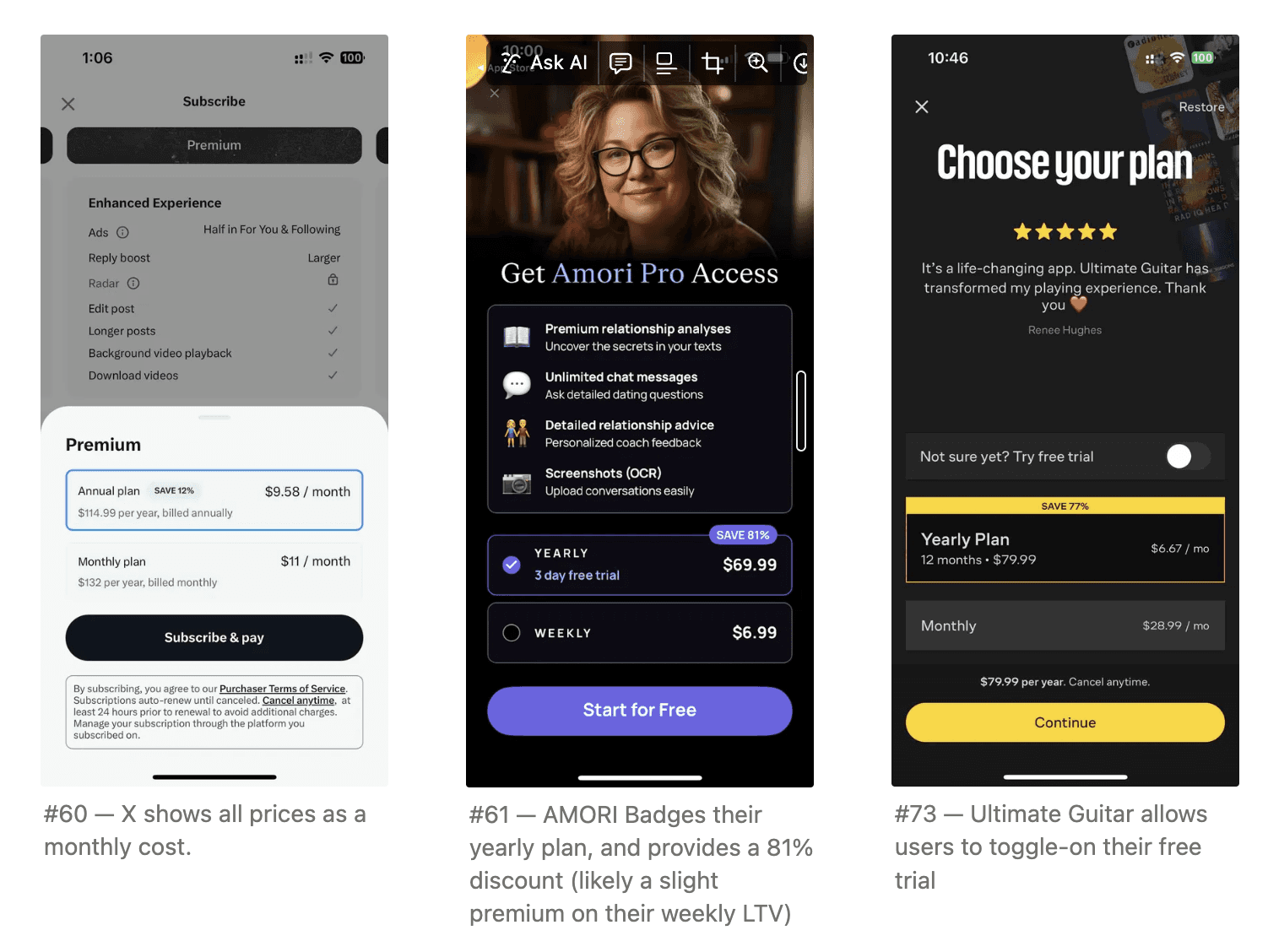
When showing plans with different durations, normalize the prices to the same time period.
For example, if you have a $13.99 monthly plan and a $99 yearly plan, show the yearly plan as $8.25 per month. Just write the full annual price the same size or larger to adhere to App Store guidelines.
Add badge for higher-LTV plans designating the discount amount
Consider only adding trials on higher-LTV plans to push users to higher-value plans.
Price annual plans at slight premium on monthly LTV
AKA if the monthly price is $3.99 and the retention is average retention is 4 mo, then the LTV is roughly $16. Consider pricing the annual plan at $19.99, even though it’s a 60% discount off the annual value it will likely increase revenue.
Price should be one of the smallest components on the app
Test how many plans to show — two often wins (monthly/annual, pro/premium) but for some apps adding a third can create the Goldilocks effect of pushing users to the middle
Once someone is on lowest tier, upgrade them.
Even when you’ve converted a user, your job isn’t done. Build additional surfaces to upsell them onto the next tier, whether it’s converting them to an annual plan or a more premium offering.
Especially if your product is seasonal, push them from monthly to yearly at period of highest intent before the season is over.
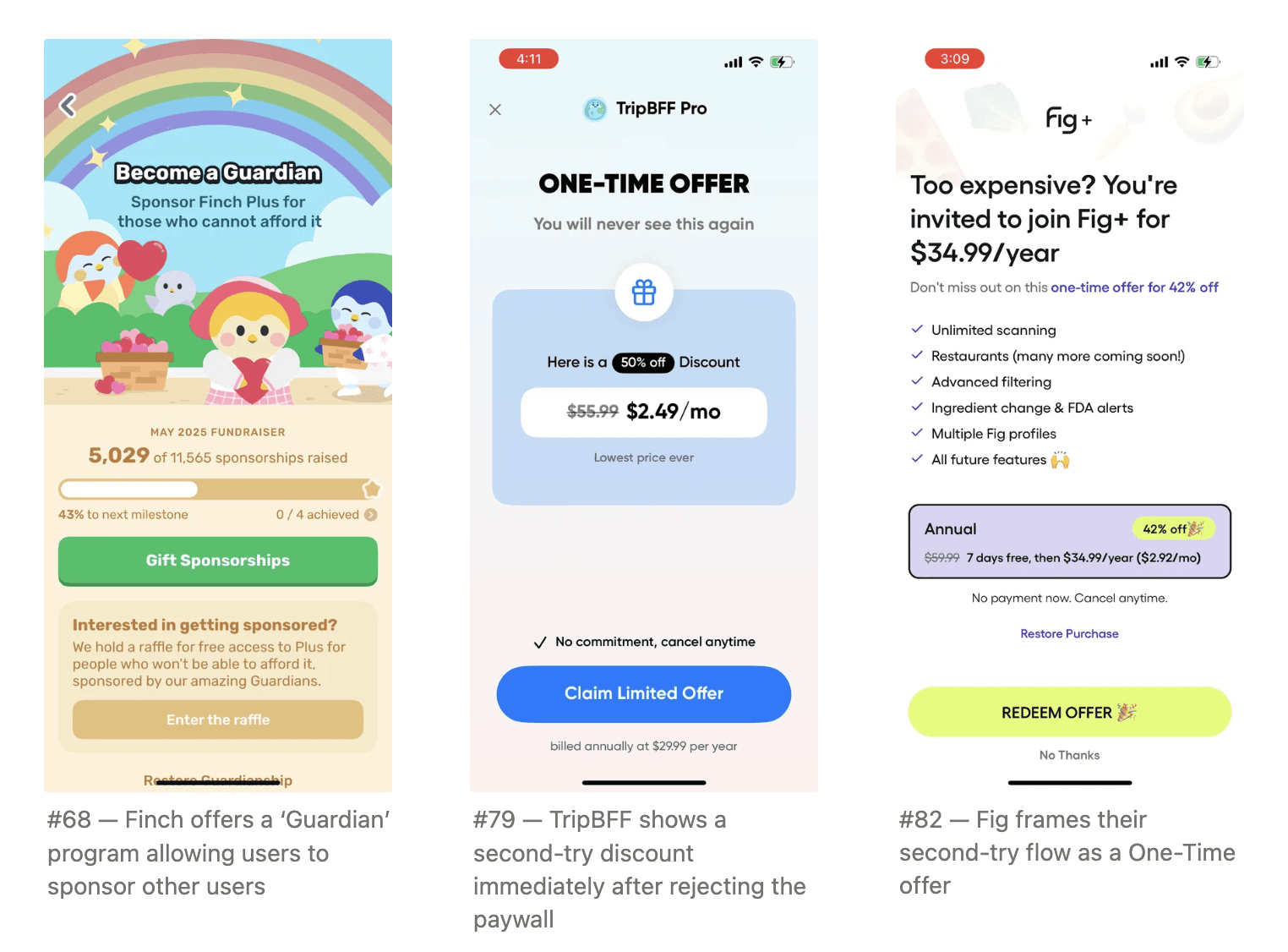
If your app is in the wellness or faith space, considering offering a plan to let premium users sponsor a plan for other users, thereby increasing overall subscriptions
Consider which plan to default at which point in app, higher-converting entrypoints can generally benefit from defaulting to higher LTV plans (or only showing them)
Allow to choose between a trial and discount offer
E.g. 7 days free then $6.99 / mo, or a discounted $2.99 for the first month.
🎈 Helium’s price personalization uses ML similar to Uber’s pricing systems to explore different prices for each region to find the value that maximizes revenue.
Price and Discounts
MAKE SURE TO PRICE TEST.
This is one of the most important paywall testing opportunities. Extensively test your prices, and how the plans compare to each other (i.e. the annual discount rate)
Vary trail lengths to see what. For some habitual products, a longer trial can more deeply engage users and result in higher conversion.
Show a trial toggle — let users decide if they want a trial (some may convert without it, increasing trial conversion)
Remove trial for existing users
Many existing users will convert without a trial, because they already are informed and have high intent. Removing the trial can increase conversion by making the trial conversion rate… 100%.
Regional price testing
Make sure to test prices in your most important regions, as Apple default often leave value on the table.
In some regions (e.g. east asia) more common to have paywall at beginning of the onboarding
Test discounts, especially as users continue to use the app without converting
Use push, especially around holidays to engage users and market subscription discounts
If a user rejects your initial onboarding paywall, consider immediately showing them a better offer (A “Second-try” flow)
You don’t have to include a discount, you can just show a cheaper plan (e.g. weekly)
Some Helium customers have improved the conversion on this second-try by adding an animation or overview content in between the first paywall and the discounted paywall
Add a countdown to the discounted paywall and show the discount is time-limited to create urgency
Change x button placement for the first and second paywalls to avoid users double-clicking through
🎈Helium can help you add new paywall entrypoints in minutes not hours, just by adding new triggers within the Helium Dashboard.
Personalization
Tailor the paywall depending on onboarding questions
E.g. if a user selected they want to use your meditation app for Sleep, customize the paywall for sleep (darker content, sleep-oriented Hero image) vs if they want it for Anxiety
Or based on the ad creative they clicked
Or based on deeplink
E.g. if the user downloaded the app via a deeplink flow to a specific type of content or flow
If you’re content oriented, show likely relevant content in your paywall
E.g. Netflix will show sports to users who subscribe to a March Madness related ad
For new users show a more informational paywall, for existing show feature-oriented paywalls
If a user previously attempted to engage with premium features, market the paywall around those
For ad-supported apps, if there are some users that are unlikely to convert, you might decrease paywall showings and increase ads to try to spur referrals and virality
🎈 Automatically personalize which images or value props to show using Helium Smart Select.
Price personalization
Using user attributes to decide which price or plan to show can often substantially increase both conversion and revenue. We’ve seen all the below inputs help
Use location, age, use case, degree of problem to decide what tier of plan to show
Add a question illuminating willingness to pay
Some apps will ask how much the user is already spending on this problem — E.g. a large face-tune glamification app asks users how much they spend on makeup
Previous subscription status
Often previously subscribed users are higher intent, and may be more willing to convert on longer-term subscriptions
Android vs iOS — Android users often have substantially lower willingness to pay and may need lower prices.
Use Machine Learning targeting — Helium’s AI ingests in your app signals to automatically decide which paywall to show to maximize revenue
Other hacks
If you’re using a trial-reminder notification, make sure you have other (ideally useful) notifications being sent as well. Otherwise your trial notification stands out too much
Offer a “Secret price” subscription that you only surface in the app store, therefore people who may be trying to cancel will opt for that instead to reduce churn
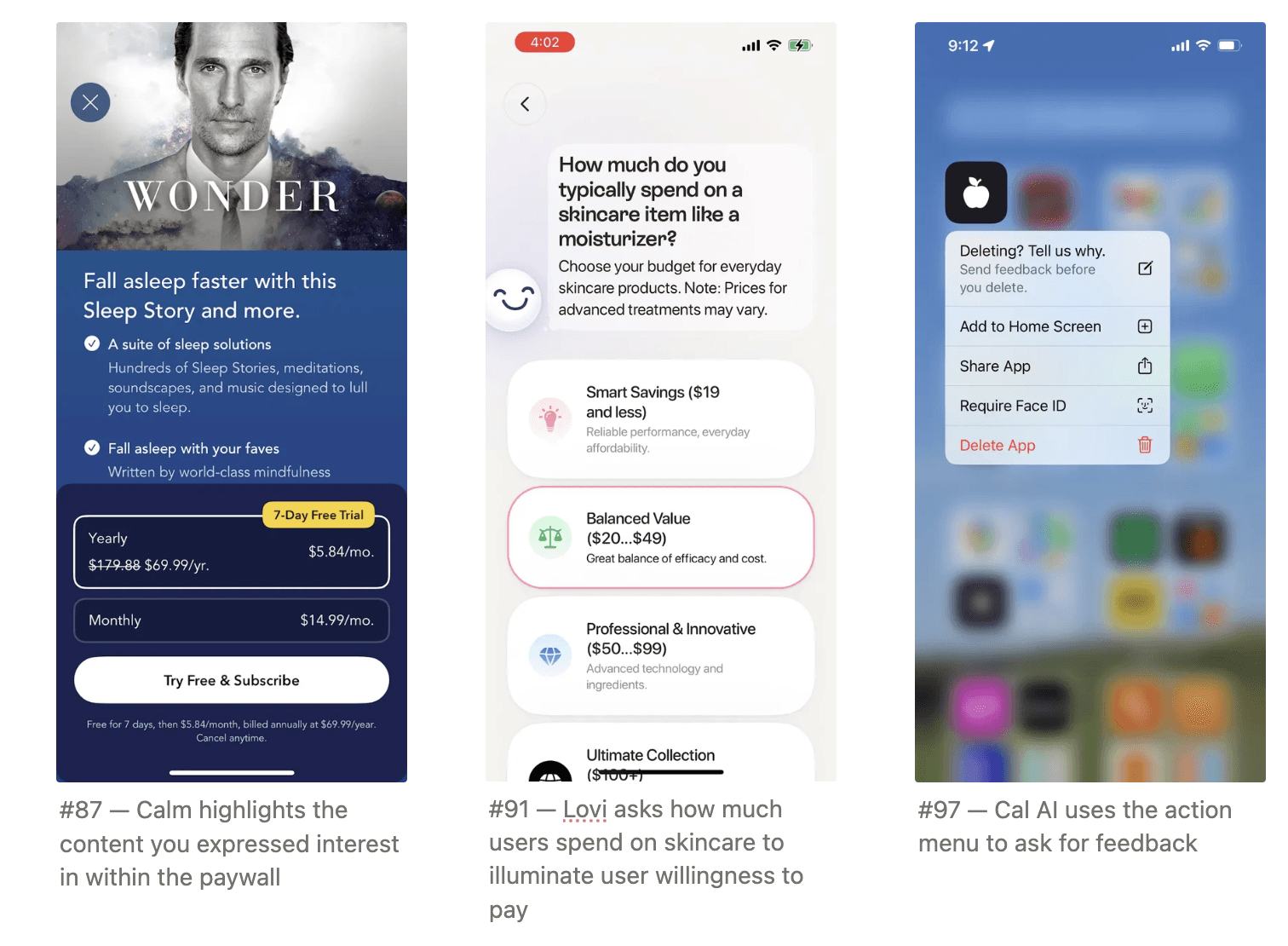
When someone long-presses the app to delete, add an action button with a reference to a special offer in their subscription tab
When someone cancels a plan or trial, show a countdown timer with remaining time left on their plan (”You’ll lose premium in 2 days, 3 hours and 2 minutes” and a CTA to re-subscribe.
In the beginning, consider offering paywall but then allowing people to refer (this just tests payment)
Once a user has subscribed for your premium offering — Make sure they get value out of it!
Help them start getting value out of premium features, and consider badging premium features so users know they are getting value out of their subscription.
Still here???
You’re clearly a paywall wiz. But, I promise you we can beat your subscription revenue.
Learn more at tryhelium.com
(If we can’t, I’ll buy you lunch)